• Skip to primary navigation
  • Skip to main content
  • Skip to primary sidebar

Jack + Mo

A Boutique Design Agency | Logo Design + Love For Your Brand.

  • Home
  • About
  • Kind Words
  • Portfolio
    • Logo Portfolio
    • Brand Style Guides
  • Design Services
  • Shop
    • Custom Design Packages
    • Deluxe Premade Logos
    • Minimalist Premade Logos
  • Blog
  • FAQ
  • Contact
  • cart

    • Wishlist
    • My Account

    Why Color Psychology Isn’t Always Applicable to Branding

    Art, Branding, Color Palette, Color Theory, Design Topics, Graphic Design, Logo Design + Branding, Understanding Graphic Design

    I’ve read so many articles and books from designers that suggest certain colors be chosen based on what they represent. Examples: you may align with colors of a certain season, or like blue because it represents stability, but I want to pose quite the opposite.

    Colors have feelings and evoke emotional responses but these feelings can be affected by what surrounds them.

    Let's try out a little experiment... okay?

    If you have a color swatch in each of your hands and the one on the left is a soft, baby blue with a hint of lavender and the one on the right is a bold orange-yellow, which one would you say is calm?

    Paint Swatch Comparison

    The left! Definitely the left!

    But let’s say you take that same soft, baby blue with a hint of lavender and it becomes oil paint that is blended into an angry storming sea rocking a small, weathered fishing boat in the turbulence?

    Tempest, Original Painting by Ivan Aivazozsky, 1886

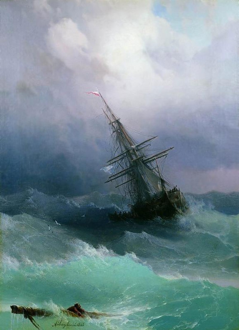
    {Painting by Ivan Aivazovsky, 1886}

    Does the soft, baby blue still feel calm?

    Nope! The application changes everything. The visuals chosen to accompany the color alter the mood entirely.

    Color psychology is a great place to begin when creating a palette for your brand but must also be a flexible visual dynamic as you develop your other branding elements- your logo mark, typography, illustrations, patterns- based on how the color feels in it's environment.

    Yellow doesn't always signify happiness.

    Red doesn't always mean passion.

    Blue doesn't always represent trust.

    Visuals accompanying a color can completely alter the feelings associated with it.

    Data on color psychology in relation to marketing and branding is controversial and can be conflicting. My advice is to simply trust your gut and go with the colors that speak to you and really make your heart soar to communicate your message effectively.

    Other related good reads + resources:

    ▸ How to Use Color Psychology to Give your Business an Edge, Forbes

    ▸ Basic Color Theory, Color Matters

    You might also like

    • Free Color Palette: Boundary by Laurie Fisher

    • Original Artwork by Xochi Solis, Amazing Color Palette Inspiration

      Free Color Palette: Assemblage

    • Brand Brilliance Book

      A Journey of Authenticity: The Brand Brilliance Book

    brand color palette, branding, color palette, color psychology, color theory, developing a brand, graphic design, logo design

    Primary Sidebar

    Love Jack and Mo Logo Design

    LOVE JACK AND MO

    Sharing tips, tricks, resources on logo design + branding! #creativemagic

    ABOUT THE STUDIO

    Meredith Myers, Logo Designer, Jack and Mo, Raleigh, NC

    Hi, I am Meredith Myers and the creative mind behind Jack + Mo, my branding + graphic design business. This sweet little blog is my place to share treats and tricks I’ve learned along the way in forming my own business, leaving a career in a stuffy office to working full-time on my creative entrepreneurship {...more}

    HELP FOR NEW CLIENTS

    How To Create The Perfect Logo

    How To Name Your Business

    Why Trendy Script Fonts May Not Be Right For Your Logo

    How to Write a Tagline in 3 Easy Steps

    Color Psychology + Branding

    Creating a Website With Limited Cash Flow

    4 Steps to Creating a Logo

    Why Pinterest Can Be Bad for Branding

    Gold Foil… How Do You Print It? 

    What is Image Resolution?

    Understanding Commercial Font Licensing

    Detailed Logos- Solutions For Making It Work

    What Is The Difference Between RGB and CMYK Color?

    What Is The Difference Between Vectors and Pixels?

    How To Get Color Codes For The Web

    FREEBIES

    Beautiful Desktop Wallpapers {1}

    Desktop Wallpapers {2}

    Free Color Palette: Boundaries Blues

    Free Color Palette: Botanical Abstract

    Free Color Palette: Tropical Tones

    more…

    HELP FOR NEW GRAPHIC DESIGNERS

    Why Deep Work is Important

    The Best Design Advice I Can Give

    The Keys to Working from Home and Productivity

    The Journey To Authenticity: The Brand Brilliance Book

    See The Forest… How Using A Different Vantage Point Can Elevate Your Design Work

    How To Apply The Joy Rule to Design

    Avoiding Burnout: 7 Ideas For Happier Workdays

    Big Magic: For All Creatives, This Book is a Must

    • Email
    • Facebook
    • Instagram
    • Pinterest

    • Home     About     Portfolio     Services     Shop     Blog     FAQ     POLICIES     Contact


    JACK + MO © 2008 - 2022