• Skip to primary navigation
  • Skip to main content
  • Skip to primary sidebar

Jack and Mo

A Boutique Design Agency | Logo Design & Love For Your Brand.

  • Home
  • About
    • Studio History
    • Kind Words
    • FAQ
  • Portfolio
    • Logo Designs
    • Brand Gallery
    • Brand Style Guides
  • Work Together
  • Shop
    • Custom Design Packages
    • The Logo Collection
  • Blog
  • Say Hello
  • Cart

    What Is The Difference Between RGB and CMYK Color?

    Color Theory, Design Topics, Graphic Design, Understanding Graphic Design


    I get this question all the time: “RGB vs CMYK — what does it even mean?”

    Here’s the quick version:

    • RGB (Red, Green, Blue) is for screens. These colors are made with light, so they look bright, vibrant, and saturated.
    • CMYK (Cyan, Magenta, Yellow, Black) is for print. These colors are made with ink, so they usually appear a bit lighter or muted compared to what you see on your monitor.


    RGB and CMYK diagram

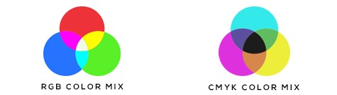
    Important: If you convert an RGB file to CMYK, the colors will shift.


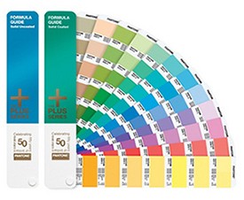
    Pantone Colors for Exact Matches

    If you need a precise color (think Facebook Blue), you’ll need to use a Pantone-specific color with a professional printer. Pantone ensures consistency across all prints for big brands.

    Pantone Guide 

    Pantone Swatch Guide


    DIY Printing Tips

    If you’re printing locally or doing it yourself:

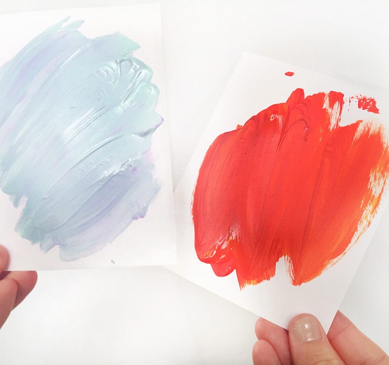
    • Expect some trial and error.
    • If a color prints lighter than expected, darken it slightly on screen and try again.
    • Adjust saturation or contrast in your editing software to get closer to your desired printed color.

    Are you using a Mac? Colors on a mac screen are WYSIWYG (what you see is what you get). So, you know your monitor is always calibrated correctly and colors appear as they should. If you are using a PC, calibrating your monitor may help.

    Keep in mind that the brightness and contrast setting on your monitor will also have an effect on the appearance of color- both Mac and PC.

    You might also like

    • Why Many Logos Feel Generic and How to Avoid It

      How to Make Your Brand Identity Memorable

    • Free Color Palette: Cinque Terre

    • Paint Swatch Comparison

      Why Color Psychology Isn’t Always Applicable to Branding

    adobe creative suite, cmyk, graphic design, rgb

    Primary Sidebar

    Love Jack and Mo Logo Design

    LOVE JACK AND MO

    Sharing tips, tricks, resources on logo design + branding #creativemagic

    HELP FOR NEW CLIENTS

    How To Create The Perfect Logo

    How To Name Your Business

    Why Trendy Script Fonts May Not Be Right For Your Logo

    How to Write a Tagline in 3 Easy Steps

    Color Psychology + Branding

    Creating a Website With Limited Cash Flow

    4 Steps to Creating a Logo

    Why Pinterest Can Be Bad for Branding

    Gold Foil… How Do You Print It? 

    What is Image Resolution?

    Understanding Commercial Font Licensing

    Detailed Logos- Solutions For Making It Work

    What Is The Difference Between RGB and CMYK Color?

    What Is The Difference Between Vectors and Pixels?

    How To Get Color Codes For The Web

    FREEBIES

    Beautiful Desktop Wallpapers {1}

    Desktop Wallpapers {2}

    Free Color Palette: Boundaries Blues

    Free Color Palette: Botanical Abstract

    Free Color Palette: Tropical Tones

    more…

    • Email
    • Facebook
    • Instagram
    • Pinterest

    • Home     About     Portfolio     Work Together     Shop     Blog     FAQ     POLICIES     Contact


    DESIGNED BY JACK + MO
    © 2008 - 2026