To figure out what design style is right for you, there are 4 important aspects to talk over:
FONT STYLE
COLOR
IMAGERY
FEELING
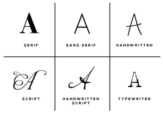
There are many other sub-categories or descriptive words you can choose to use (for example: italic, brush, calligraphy, stencil, etc.) but these are the most widely-used and cover most. What overall font style do you tend to be drawn to the most?
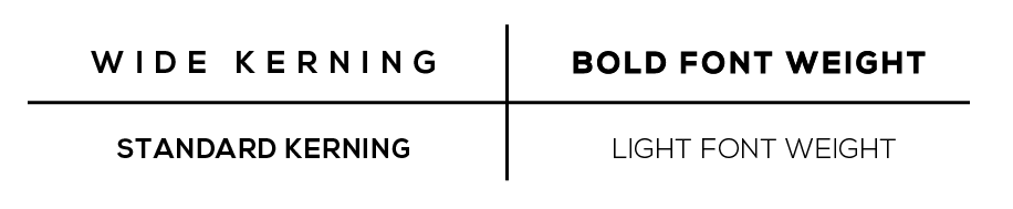
Other little visual aspects in regards to fonts...
Font kerning is the spacing between the letters. You can have anywhere from very tight kerning to standard or loose.
Font weight describes the thickness of the letters. Many font styles come available in different font weights i.e. heavy, bold, normal, light, extra light. However, some fonts are available in only one weight. (Designers can often edit standard fonts to be lighter or heavier.)
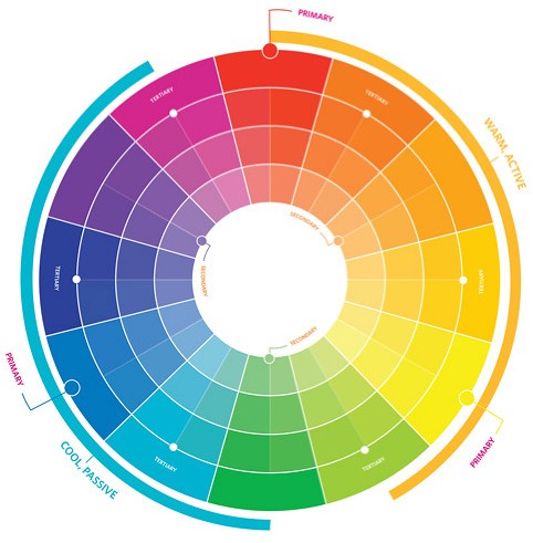
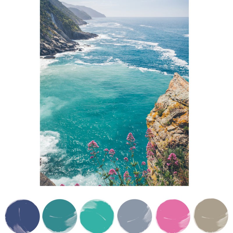
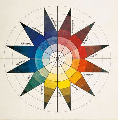
2. COLOR
The next SUPER important design element decisions is in regards to color.
Color choice can evoke a certain mood and bring about a subliminal psychological response. (Color can also evoke different responses for different people, and may have different meanings cross-culturally.)
Consider your audience and what you want to say about your company. Do you want a bold, energetic design? Consider warms like yellow and red. Do you want a subtle, soothing design? Consider cool tones like blue or green.
Design Seeds, Pantone and Colour Lovers are GREAT places I'd strongly recommend to review potential color palettes.
A little nerdy segue... it's hard to imagine a time when color concepts didn't exist, isn't it? Leonardo da Vinci was one of the first known writers to examine color theory in the late 1400's. In 1666, Isaac Newton introduced his Theory of Color, including the primary colors. A hundred years later, secondary, tertiary, and the concept of warm and cool colors were added to our current understanding of color theory.
![]()
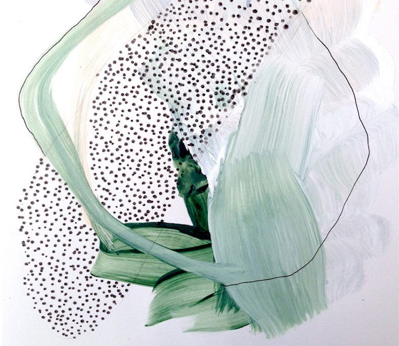
3. IMAGERY
The next important design decision is in regards to imagery. Will your design include an icon?
Logos can either A.) include an illustration or B.) be typographic only (this is called a logotype).
![]()
Think about the ways you plan to use your logo. Printing on business cards? Placing it on the header of your website? Insta/Facebook profile image? Printing on t-shirts? Having a stamp made?
If a design is too detailed, the versatility may be compromised. However, a way around this is to have various versions of the logo (text only, illustration and text, condensed version of the design, icon version, etc.)
Most logos need to be scalable, meaning they work well in a very small format as well as a very large format.
Do you want your design to include some kind of cool illustration or icon, or be solely text?
![]()
4. FEELING
And the last MAJOR design decision is in regards to the overall FEELING of the design!
How do you want the design to feel? What lasting impression should the design give?
Unique, professional, handmade, artistic, corporate, organic, clean, precise, balanced, symmetrical, layered, simple?
Consider what a potential viewer may feel within the first 10 seconds of seeing your design. Research conducted by EyeTracking, Inc. shows that a consumer can make a choice in as little as a third of a second.
In short, a logo should quickly embody who you are and what you do. How can you visually achieve this? Consider font style, color, the use of imagery and overall feeling and you've got it!