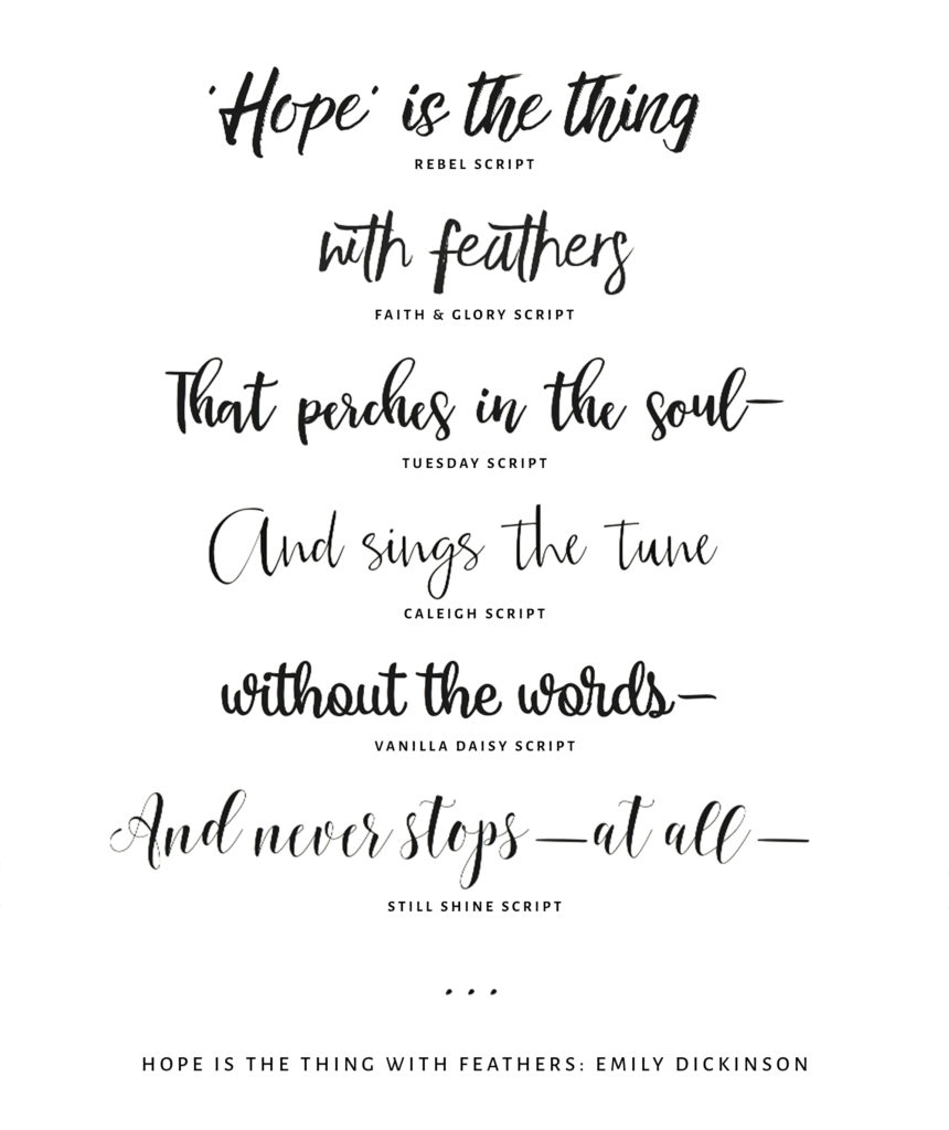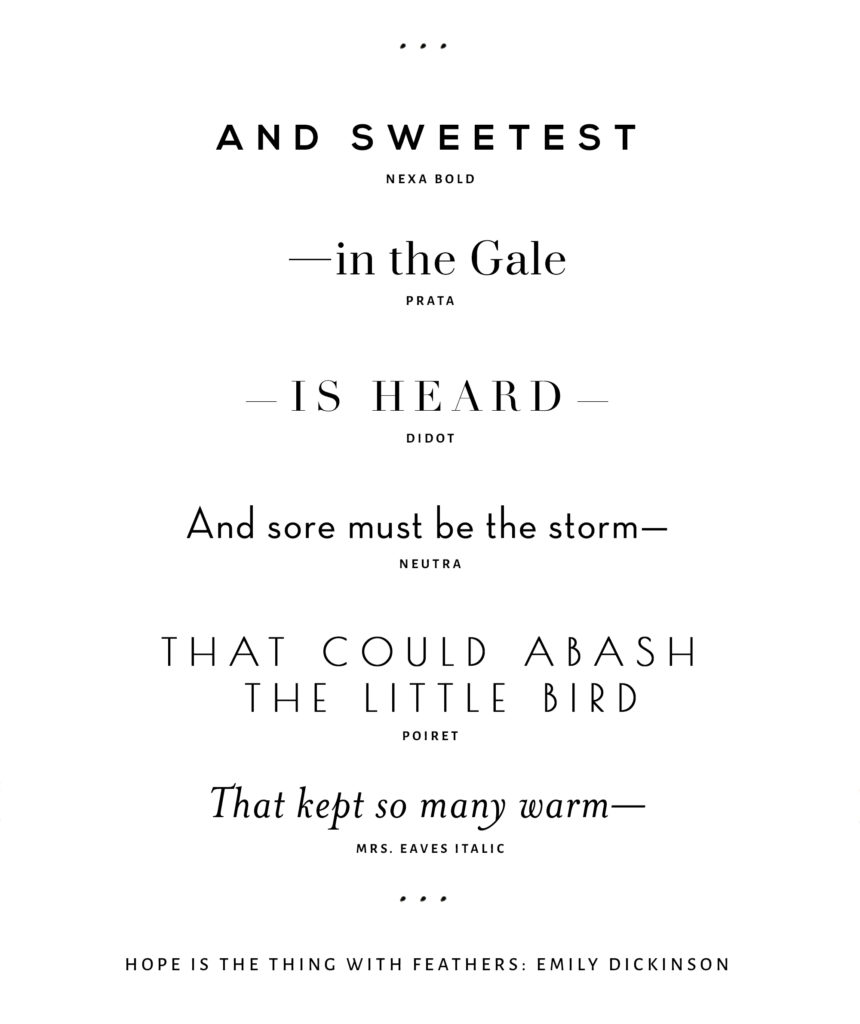
Inky, calligraphy fonts are so intriguing… their beauty and form seem like an instance win, right?! You may think- done. I want this for my logo. But it may be the very wrong choice.
Luscious script fonts have a tendency to grow in popularity quickly. HERE IS HOW IT GOES DOWN…
You find a script that is an instant love for you. You buy it, spend a lot of money making it part of your logo and brand style, and then you start seeing it everywhere. Cheap diner menus… body wash… bad commercials…
A font I once loved I spotted in the Dollar Tree on a package. (Ugh, heck yeah I shop there. Don’t even get me started on how amazing their book section is. I’ve read some very, let’s say, noteworthy… literature) Anyhow, back to the font I so dearly loved. I thought– it officially has to be dead to me now. That means the font style made it’s way from the top of the retail chain to the basically… the bottom.
So what do you do? I recommend to many clients with timelessness and longevity as a major goal for their branding to choose a clean serif or sans serif font for their logo design.
THEN choose a script font you can’t live without. Put that ish on everything else- your social media, website, packaging. Then when you tire of it (which could happen as soon as 6 months from now!) you just pick a new one that tickles your fancy and have fun with it.
If being on trend is your major goal for branding and you find a script you love, go for it! This is only one gal’s opinion. Branding choices are personal and there are no hard-bound rules that have to be followed. You may want to update in a year or so to something else trendy, or you may not. Choices for art can be anything of your making, right?


