Businesses often want to match their interior paint colors to the color palette created for Matching interior paint colors to your brand’s color palette can create strong visual cohesion in your space — whether it’s your office, studio, or retail environment. But how do you take digital colors (Pantone or hex codes) and turn them into real paint swatches you can buy?
Today there are better tools than ever that help you translate brand colors into paint options from major brands like Benjamin Moore, Farrow & Ball, Behr, Sherwin‑Williams, and others.
1. Use Cross‑Brand Paint Matching Tools
Websites like Paint Color HQ let you search 23,000+ colors across 14 major paint brands by hex code, name, or brand. You’ll see the closest paint color matches and can even preview them before buying.
Benefits include:
- Matches across brands (Sherwin‑Williams, Behr, Benjamin Moore, Farrow & Ball, etc.)
- Visualization tools to preview colors in context
- Palette generators and room visuals to explore coordinated schemes
This kind of tool helps you take a digital color (like #8A2BE2) and find real paint equivalents you can buy at the store.
2. Upload a Photo or Swatch to Identify Colors
If you have a physical object or inspiration image with a color you want to match, tools like PaintColorHQ’s Photo Color Identifier let you upload a photo and click on a hue to find the closest matching paint colors across brands.
This is helpful when:
- You’re trying to match a fabric, logo swatch, or mood board color
- Your palette isn’t just digital — you want a real‑world reference
- You want paint brands that have equivalent named or coded colors
3. Try AI‑Powered Color Match & Preview Apps
Newer tools like PaintSpy AI let you:
- Scan any color with your phone camera
- Get instant paint matches for brands like Benjamin Moore and Sherwin‑Williams
- Preview colors using augmented reality so you can see them on your walls before buying
- Generate coordinated palettes based on your selected hue
These modern tools make matching intuitive and visual, so you don’t need to rely on physical swatch chips alone.
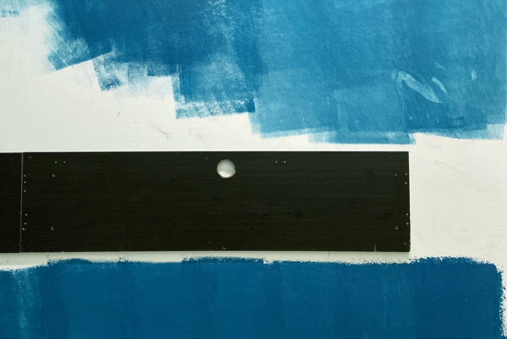
4. Always Verify with Physical Samples
While online tools are incredibly helpful, digital screens and printouts aren’t perfect representations of real paint. Variables like lighting, surface texture, and sheen affect how paint looks once applied. Most design pros recommend:
- Ordering sample pots or peel‑and‑stick swatches
- Painting a test patch in the actual room
- Observing color at different times of day
This ensures you don’t just like the idea of a color online — you love it in your space.
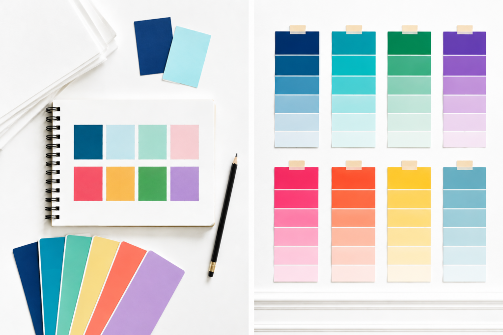
Tips for Translating Digital Colors to Paint
- Match by code, not name — color names vary across brands, but numeric codes and hex values are more precise.
- Check undertones — two colors that look similar online can feel very different in real light.
- Use coordinated palette tools — generators help you build a full set of wall, trim, and accent colors from one starting hue.
Bottom Line
Turning your brand palette into a real‑world paint scheme is easier than ever with modern color‑matching tools. Instead of guessing or relying solely on brand‑specific apps, use cross‑brand matchers, visualizers, and AI tools to find paint colors that feel intentional, cohesive, and true to your brand vision.