• Skip to primary navigation
  • Skip to main content
  • Skip to primary sidebar

Jack and Mo

A Boutique Design Agency | Logo Design & Love For Your Brand.

  • Home
  • About
  • Kind Words
  • Portfolio
    • Logo Portfolio
    • Brand Style Guides
  • Design Services
  • Shop
    • Custom Design Packages
    • Deluxe Logos for Purchase
    • Minimalist Logos for Purchase
  • Blog
  • FAQ
  • Contact
  • cart

    Detailed and Colorful Logos, Solutions for Making it Work

    Business + Marketing, Color Palette, Logo Design, Logo Design + Branding, Understanding Graphic Design

    Detailed and colorful logos almost always look good on the web, so if your intentions are to showcase your impactful design on your website and social media sites– go for it!

    But if you have worries about a detailed logo being limiting, read on! How will it look at a small size? How will it print? 

    Let’s talk about the two biggest potentials issues, and simple solutions around it… so you can have your color and detail— AND a fully functional and versatile logo design!

    Spa Logo Design in Rose Gold Metallic

    Wouldn’t this Melandri Spa logo look stunning on a website? But how would it function everywhere else?

    ISSUE 1: SCALABILITY

    Potential Issue: A design rich in detail and color can be hard to see at a small size.

    Solution: Have additional versions of the logo limiting detail. So easy! And these make for fun additional graphic elements for a cohesive brand.

    Spa Logo Design Identity Examples

    There is a huge range of possibilities for additional simple versions with this design! Doesn’t it make for a beautiful collection of graphics?

    ISSUE 2: PRINTING

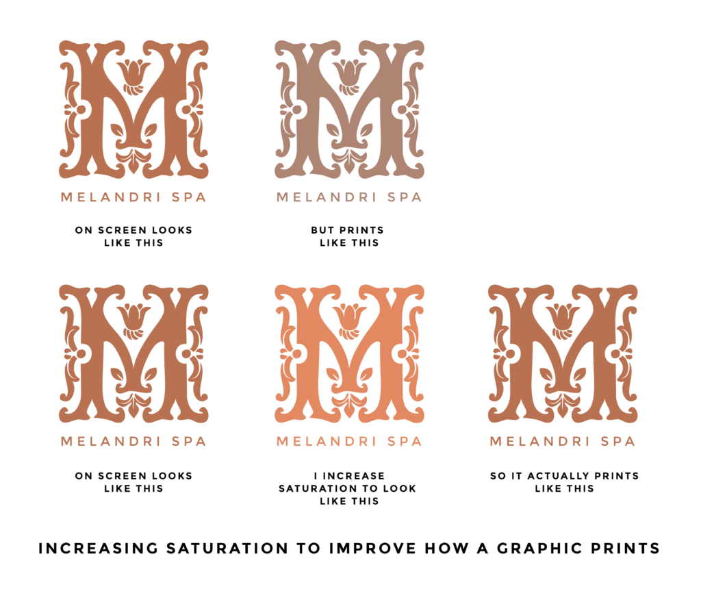
    Potential Issue: A colorful design can appear muted and dull when printed compared to what is seen on screen. (Why? To understand the difference between graphics on screen and graphics in print, Read here.)

    Solution: Increase the contrast and saturation of the design so the colors print more vividly.

    Increasing Saturation to Improve How a Graphic Prints

    If detail and color variation are important factors for you, don’t let scalability and printing deter you. A proper plan and understanding the details will ensure your logo looks best in any situation.

    You might also like

    • Design Trend:  Saturated Colors are Back! But with a New Spin.

    • how to edit your own graphics

      Ways To Make Edits To Your Own Graphics

    • How To Overcome Fear

      How To Overcome Fear

    artistic branding, branding, custom illustrations, graphic design, logo design

    Primary Sidebar

    Love Jack and Mo Logo Design

    LOVE JACK AND MO

    Sharing tips, tricks, resources on logo design + branding #creativemagic

    HELP FOR NEW CLIENTS

    How To Create The Perfect Logo

    How To Name Your Business

    Why Trendy Script Fonts May Not Be Right For Your Logo

    How to Write a Tagline in 3 Easy Steps

    Color Psychology + Branding

    Creating a Website With Limited Cash Flow

    4 Steps to Creating a Logo

    Why Pinterest Can Be Bad for Branding

    Gold Foil… How Do You Print It? 

    What is Image Resolution?

    Understanding Commercial Font Licensing

    Detailed Logos- Solutions For Making It Work

    What Is The Difference Between RGB and CMYK Color?

    What Is The Difference Between Vectors and Pixels?

    How To Get Color Codes For The Web

    FREEBIES

    Beautiful Desktop Wallpapers {1}

    Desktop Wallpapers {2}

    Free Color Palette: Boundaries Blues

    Free Color Palette: Botanical Abstract

    Free Color Palette: Tropical Tones

    more…

    • Email
    • Facebook
    • Instagram
    • Phone
    • Pinterest

    • Home     About     Portfolio     Services     Shop     Blog     FAQ     POLICIES     Contact


    JACK + MO © 2008 - 2025