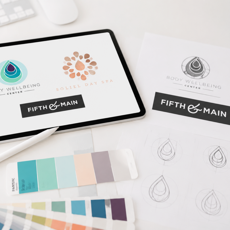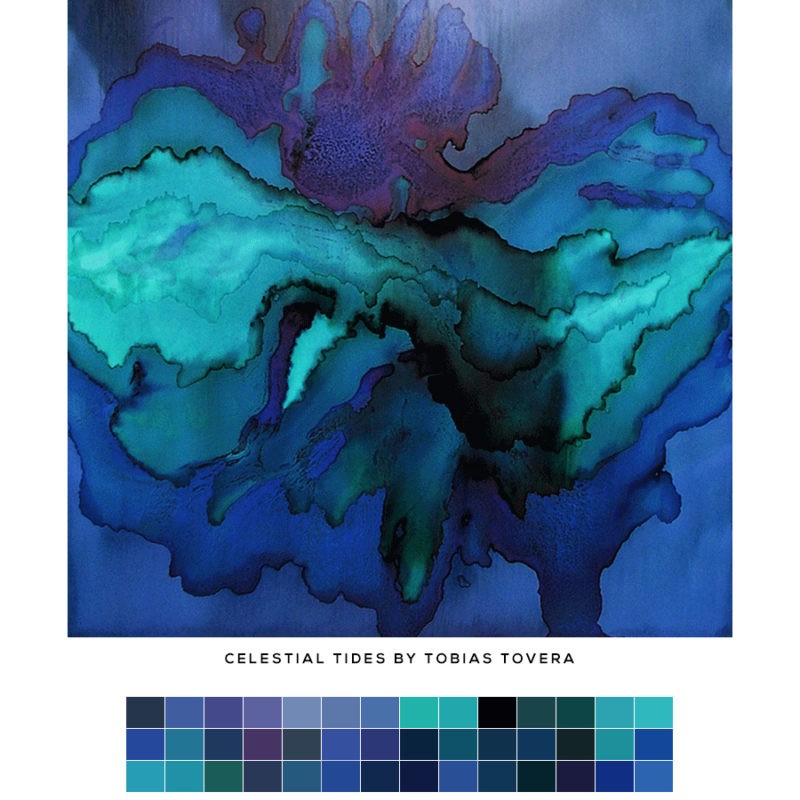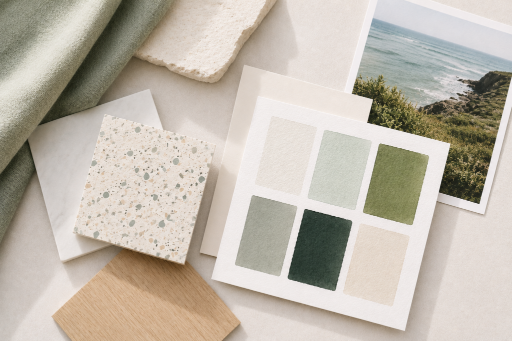
While colors may seem simple on the surface, they play a huge role in shaping how a business feels.
A thoughtful palette communicates personality, mood, and tone instantly.
Soft neutrals can feel calming and elevated. Rich jewel tones- luxurious and grounded. Bright colors often create energy and playfulness.
Initially, the process usually begins with inspiration. Sometimes it comes from artwork, interiors, fashion, nature, architecture, or photography. Other times, it starts with a feeling a client wants their business to evoke. Examples might be warm and welcoming, refined and modern, organic and relaxed, bold and confident.
From there, colors are refined into a balanced grouping that works beautifully together for any usage- web, printed materials, packaging, signage, social media, and more.
Most brand palettes include a mix of primary colors, softer supporting tones, neutrals, and a few accent colors for depth and flexibility.
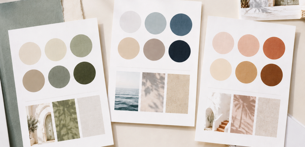
There is no set formula for a brand color palette. Some contain only a few colors. Others include a broader range of hues, values, and neutrals. The right approach depends on the brand.
The goal is to create something cohesive, recognizable, and lasting — with enough depth and flexibility to work beautifully across everything from websites and packaging to social media and print.
One of my favorite parts of the process is seeing how a thoughtfully chosen palette can shape the essence of a brand.
If you’re looking for custom branding tailored to your business, feel free to get in touch. I’d love to help create something meaningful for you.