One of my favorite challenges in logo design is creating a sense of movement within a completely static design.
A logo will never actually move, but it can still guide your eye. It can have rhythm. It can feel graceful and effortless.
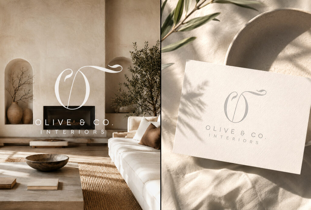
That’s one of the things I was thinking about when I designed this logo for Olive & Co. Interiors.
At first glance, it’s a simple monogram. But the sweeping “O” creates a natural visual path that carries your eye through the mark before settling on the company name below. That single gesture gives the logo elegance without adding unnecessary complexity.
Years later, it’s still one of my favorite logos because it reminds me that timeless design isn’t about trends—it’s about fundamentals.
The Difference Between Simple and Static
Minimalism doesn’t have to feel rigid.
Some of the most memorable logos are incredibly simple, but they still have energy. That’s often created through subtle details like proportion, balance, line weight, negative space, and movement.
Those are the details people may never consciously notice, but they’re often what make a logo feel refined.
Timeless Design Is Intentional
This logo was designed years ago, yet it still feels just as relevant today.
That’s always my goal—not to create something that’s trendy for a season, but something that continues to represent a business beautifully for years to come.
When every line has a purpose, simplicity becomes memorable.
Every logo has a story. My job is to translate yours into something simple, meaningful, and unmistakably yours.
If you’re ready to build a brand that reflects who you are and where you’re headed, I’d love to hear about your project.