For years, logos all seemed to be heading in the same direction. Plain, plain, plain. So why is hyper-individualism now replacing this brand approach in logo design?
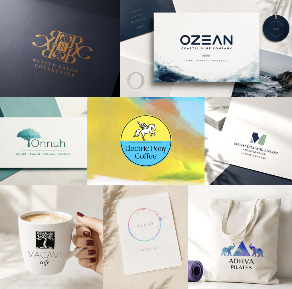
Minimal sans-serif fonts. Flat icons. Black-and-white color palettes. Clean, geometric shapes. Logos became more versatile for digital use—but many also became forgettable.
Designers even gave it a name: blanding.
Now, the pendulum is swinging back toward hyper-individualism.
Standing Out Matters Again
Today’s consumers see thousands of brands every day. When everything looks polished, polished isn’t enough.
Memorability comes from personality.
We’re seeing a return to:
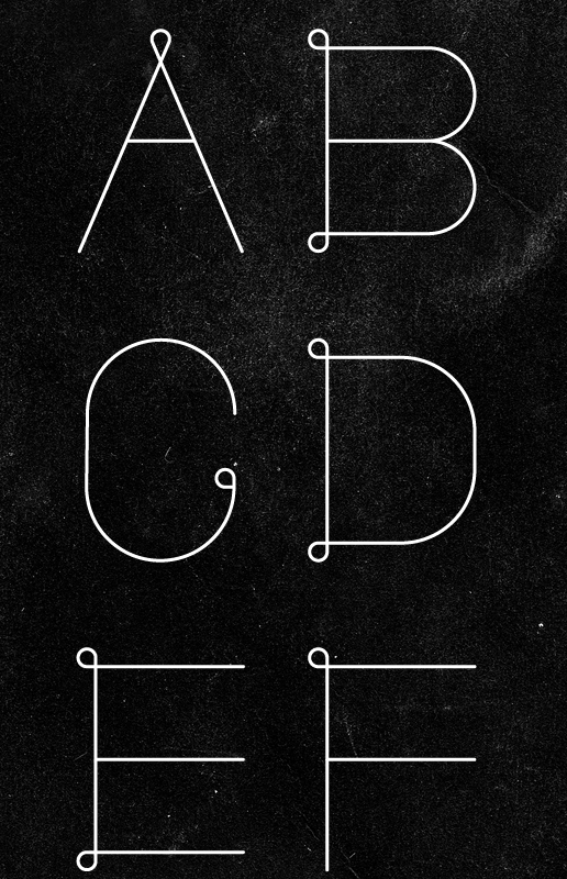
- Custom typography
- Rich color palettes
- Handcrafted details
- Playful illustrations
- Vintage influences
- Imperfect, human touches
Yay!
Instead of trying to appeal to everyone, brands are becoming unmistakably themselves.
AI Is Accelerating the Shift
AI can generate hundreds of beautiful logo concepts in minutes. That’s an incredible advantage.
But many AI-generated designs share similar visuals because they’re built from the same body of info.
Creating something that looks pretty darn good is easier than ever.
Creating something that feels uniquely yours is the challenge.
Personality Is the New Competitive Edge
Consumers don’t just buy products—they buy stories, values, and experiences.
The strongest logos communicate personality before someone reads a single word. The best brands don’t just look good—they feel personal.
Different Is Better Than Generic
Hyper-individualism is about making intentional design decisions that reflect who you are.
The best logos don’t chase trends.
They express identity.
Looking Ahead
Minimalism isn’t going away, but generic minimalism is.
As AI makes pretty decent design more accessible, originality becomes even more valuable. The brands that leave a lasting impression have personality and purpose.
Because a great brand should feel like no one else but you. ⭐