When it comes to logo design, few things are more insightful than analyzing the all-time greats.
What makes a successful logo design, and how do you measure its success?
Instant recognition.
It’s a simple mark that people can imagine when the brand name is spoken, or see the symbol and instantly know the company name.
The symbol identifies the brand.
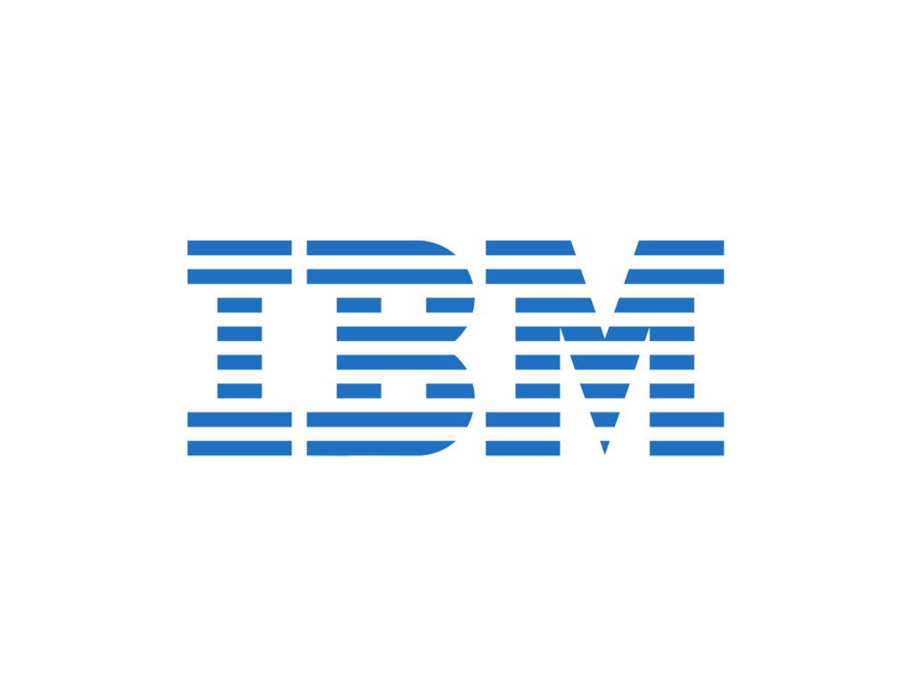
“A logo does not sell, it identifies.” –Paul Rand (Author of “Thoughts on Design“, logo designer for IBM, ABC, UPS, and more)
It’s estimated that consumers react to a logo in 5-8 seconds. The human brain processes images at a rapid speed, much faster than words. A team of MIT neuroscientists confirm the human brain can process images in as little as 13 milliseconds. (news.mit.edu source)
Here are some factors to consider when thinking through the components that make up a strong design (icon, font, color):
61% of Fortune 500 companies have a combination logo (text + icon)
43% of Fortune 500 companies use logos with 2 colors (37% use only 1 color, 14% use 3 colors)
Blue is the most favored color for logos, as it represents stability and security (40% of Fortune 500 companies utilize blue in their logo) (source: Daily Blogging) (black is a close second, then red, green)
73% use a sans serif font style (only 18% utilize a serif font, 6% a combination, and 2% a script or other)
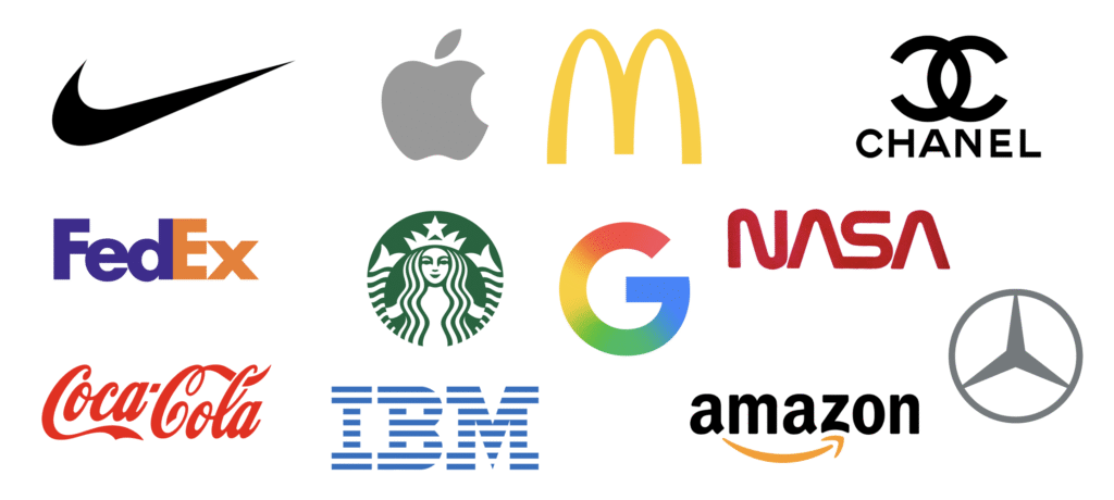
Let’s explore 12 of the most iconic and successful logo designs in American history:
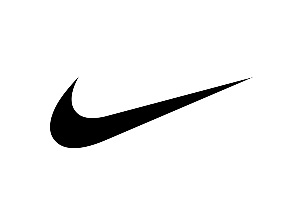
Nike
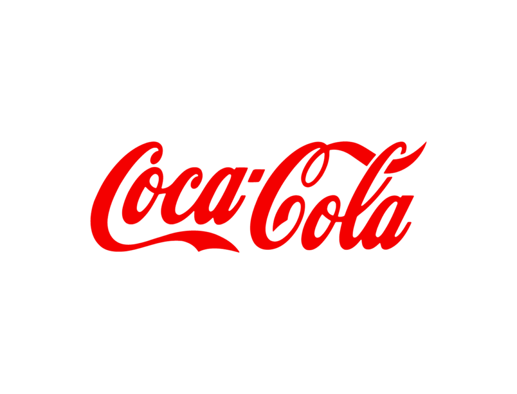
Coca Cola
Apple
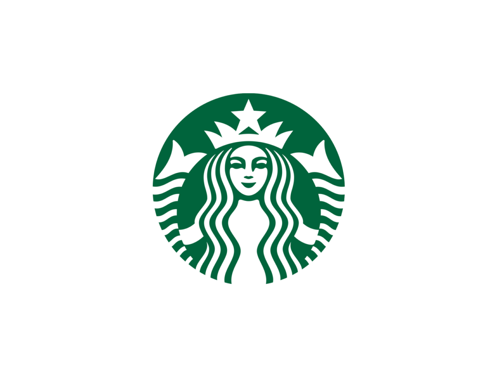
Starbucks
McDonalds
FedEx
Google
Amazon
Chanel
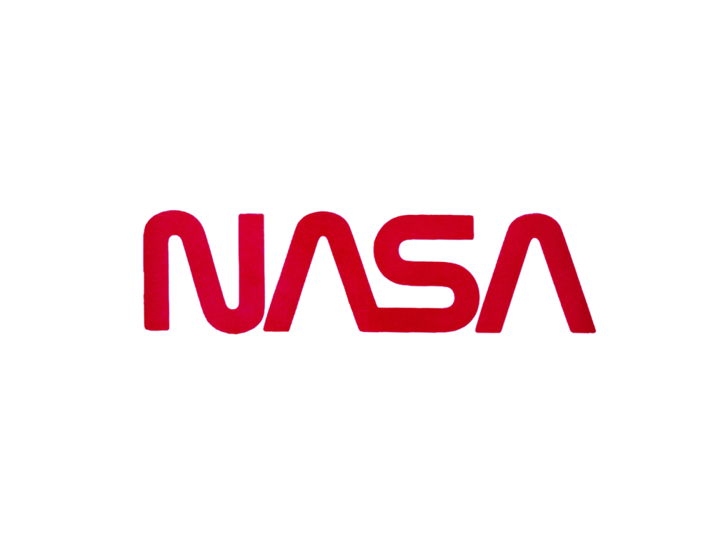
Nasa
Mercedes
IBM
There is a commonality of very clean lines, bold colors, limited color palettes and easy scalability. These top performing examples showcase the perfect balance of blending in while shining through.